Introduction
In light of the 2022 election results which appear to show Republicans have secured a supermajority of seats in the Montana state legislature, I have been asked to review the underlying partisanship of four maps submitted to the state’s independent redistricting commission and to determine if they comply with the guidelines proposed by the commission. In particular, I was asked to evaluate whether the maps may be classified as political gerrymanders, and/or whether they appear to be drawn primarily to benefit one party over the other. I was asked to use metrics used in court cases to date. This analysis will help inform Montanans about the possible makeup of future legislatures based on the proposed legislative redistricting maps and, by extension, the types of policy changes that Montanans might be able to expect from their government in the coming years.
Courts have generally used two approaches to determine whether a map is a partisan gerrymander. The first approach can broadly be thought of as a “partisan fairness” metric. These metrics compare electoral outcomes in districts to various theories of what a “fair” map might look at. I examine two commonly utilized “partisan fairness” metrics: The efficiency gap and the median-median score. The second approach instead uses computer simulations to explore what maps in the state that are drawn without reference to partisanship might look like. It then compares proposed or enacted maps to this simulation, to determine whether those maps are outliers. I conclude that maps 1 and 4 do not appear to be drawn primarily to benefit one party and are not political gerrymanders, regardless of the metric employed. Maps 2 and 3, however, do appear to heavily benefit the Democratic party.
The Efficiency Gap
The efficiency gap was proposed by Eric McGhee in a 2013 article in Legislative Studies Quarterly. It is motivated by the following intuition: When a party seeks to draw a gerrymander, it does so by attempting to “waste” as many of the other party’s votes as possible. It does that in two ways. First, the party tries to create as many districts that will narrowly elect its candidates as it can. When this happens, the votes of electors who support the other party’s candidates become distributed inefficiently: They are cast in districts where they do not convert those votes to seats. Second, in places where the redistricting party must create a district won by the other party, it does so by packing as many voters as possible into that district.
Thus, “wasted votes” are those votes that are either cast in a district where they don’t lead to the party capturing a seat, or those votes cast for a party beyond that which is needed to win the seat. So if 100,001 votes are cast in a district, and a party wins 50,000 votes, it loses the district by a vote and wastes 50,000 votes. If it wins 50,001 votes, it wins the district, and doesn’t waste any votes. If it wins 100,000 votes, it would have been better off if some of those votes were spread into other districts, making them competitive; it wastes 49,999 votes.
The efficiency gap looks at the “net” wasted votes for each parties. If more Republican votes are wasted than are Democratic votes, a positively-signed efficiency gap is created, suggesting pro-Democratic bias. If more Democratic votes are wasted than Republican, a negatively-signed efficiency gap is created. The net wasted votes are then divided by the total number of votes cast, creating a metric that can be thought of as the percentage of votes cast in a state that are, on balance, wasted for one party or the other. The more one party’s votes are wasted, the more the efficiency gap grows.
One of the upshots of the efficiency gap is that it awards a “winners’ bonus” to the party that wins seats. That is to say, it does not proceed according to proportionality (nor do any of the metrics proposed in courts). This is in line with a voluminous body of political science work suggesting that single member districts do not naturally produce proportional representation. That is to say, on balance – though this is not always the case – maps drawn without respect to politics will tend to produce non-proportional outcomes. For the efficiency gap, it tends to award two percent of the seats for every percent of the popular vote a party wins beyond 50%. Notably, at 50% of the popular vote, the party would be entitled to 50% of the seats. As a theoretical matter, then, the efficiency gap always results in the party that wins a state’s popular votes winning control of the chamber.
The efficiency gap has been subjected to a number of criticisms, including by myself, but there are three important leading criticisms. First, the efficiency gap is unduly sensitive to the 50% mark. The example from the earlier paragraph illustrates this nicely. A party that wins 50,000 votes wastes 10s of thousands of votes, but a miniscule change in the political environment leads to the party not wasting any votes. A shift of this magnitude can have a significant impact on the overall efficiency gap score. You can imagine a world where a party gets 49% of the vote in one election, resulting in a large efficiency gap against it, while in the succeeding election it receives 51% of the vote, resulting in a large efficiency gap against the other side.
In the hypothetical world upon which the efficiency gap is based, this isn’t a problem, since the gerrymandering party dictates where the votes go. But the frame for the efficiency gap assigns too much agency to the gerrymandering party. That party can’t assign actual votes. It can take a guess as to how votes will go, but can’t know for certain. In the absence of such information, a true gerrymander would try to build in a cushion in a district; the goal wouldn’t be 50%+1 districts, but rather districts where the party wins 55 or 60% of the vote.
Additionally, the efficiency gap doesn’t take into account a state’s political geography. That is to say, some states will tend to naturally produce large efficiency gaps due to partisans being concentrated in one location. Indeed, the legal test for the efficiency gap suggested by McGhee in a subsequent article, co-authored with Nicholas Stephanopoulos, specifically empowers a government to rebut a claim that it created an unconstitutionally large efficiency gap by demonstrating that its efficiency gaps are due to compliance with legitimate redistricting considerations or the state’s underlying political geography.
Finally, the efficiency gap doesn’t answer the question “how much gerrymandering is too much.” Indeed, it is on these shoals that the federal challenge to the efficiency gap foundered in 2019. Although plaintiffs in cases have suggested various thresholds to answer the question “when does an efficiency gap become too large,” including a proposed threshold of 0.07 for legislative maps, it is never entirely clear where those thresholds should be located.
Mean Median
Another partisan fairness metric is the “mean median” metric. The mean median metric simply looks at a party’s statewide vote share and subtracts the party’s median district vote share. It is motivated by the notion that things that happen at the extremes of a map do not matter much, particularly for legislative districts. Instead, what we are most concerned about is ensuring that the middle district is one that is in line with the state’s underlying partisanship. That is to say, in a 99-seat chamber, the partisanship of seat number 50 is far more important than the partisanship of the 99th most Republican seat, because seat number 50 determines who controls the chamber. By ensuring that a party’s performance in seat number 50 lines up with the party’s statewide performance, the mean median score limits a party’s ability to gerrymander control of the chamber to its benefit, even if it might gerrymander the size of its majorities. The mean median score, however, suffers from many of the critiques above.
Evaluations of the Proposed Maps under Partisan Fairness Metrics
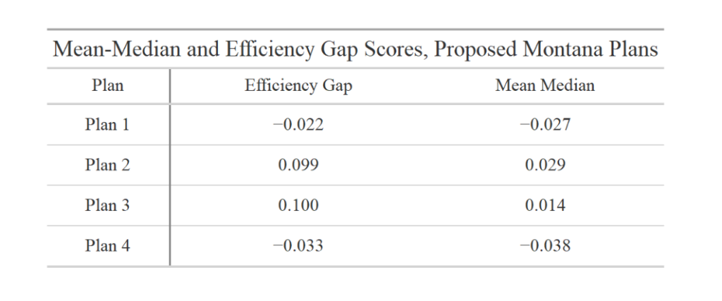
Critiques aside, the mean-median and efficiency gap scores have been utilized by experts in the field and accepted by some courts. I’ve calculated the mean-median and efficiency gap scores for the proposed submitted plans. To calculate the scores, I have taken the races that the redistricting commission has identified as appropriate for measuring partisanship, and calculated vote totals in each district for each map. I then calculated the appropriate mean median and efficiency gap scores using the statistical programming package R.
As you can see, Plans 1 and 4 create small pro-Republican efficiency gaps, which are below the thresholds proposed by Courts for identifying a gerrymander. Plans 2 and 3, however, create significant pro-Democratic efficiency gaps. Indeed, they are as large as the efficiency gaps created by the state of Wisconsin’s plan which was at the center of the Gill litigation did in 2014.
The mean-median scores are a bit of a mixed bag. Plans 1 and 4 create modest pro-Republican mean-median scores, while Plans 2 and 3 create modest pro-Democratic mean-median scores. It is worth observing, however, that the median-median score is problematic once a state’s partisanship exceeds 55% for one party or the other, as is the case here.
Simulations
A competing approach is to use computer simulations to identify what maps drawn without respect to politics would look like, and then compare proposed or enacted maps to those simulations. This is a technique I’ve utilized in various courts, including New York and Maryland. While the details are quite complicated and beyond the scope of this paper, the idea is this: A computer draws maps with the same basic parameters as the map drawers, but it does not have access to partisan data. In other words, it attempts to mimic the approach the map drawers would have taken if they were truly drawing maps without partisan information. If the proposed/enacted maps resemble the computer-drawn maps, we can conclude that the maps were, in fact, drawn without excessive reliance on partisan data. If, however, the produced maps do not resemble the computer-drawn maps, those maps were likely drawn with excessive reliance on partisan data.
Here, the computer was instructed to take the 43,717 Montana census blocks with some population (unpopulated blocks were merged with neighboring blocks for computational efficiency purposes) and to build 1,000 maps according to the following rules: Counties could not be split more than once, districts must be drawn to be compact, and the Voting Rights Act must be followed. There are a number of ways to facilitate the last parameter, but the most straightforward way is to “freeze” certain minority-majority districts in place. For purposes of this simulation, I instructed the maps to ignore the blocks in districts 15, 16, 31, 32, 41, and 42 of proposed Map 2. This ensures that every map in the ensemble has six majority-minority districts, which mirror the districts suggested in Map 2. This is a touch unfair to maps one and four, which have their own sets of slightly different “ability-to-elect” districts, but probably suffer only slightly in the comparison.
The results once again suggest that Maps 2 and 3 are partisan outliers, while Maps 1 and 4 more carefully follow the partisanship of the state. One way to display the data are with dot plots. The idea is as follows: The program takes the first map, looks for the most heavily Republican district, and finds the partisanship of that district. A dot is then placed on the map at that level of partisanship. It then does this for all 1,000 plans, so that the left-most column shows the partisanship of the most heavily Republican district in all 1,000 plans. It then does the same things for the second- third- and fourth most heavily partisan districts, and so forth.
The following four charts compares the outcomes of the simulations to the four plans. For each proposed map, the partisanship of the most-Republican district, second-most-Republican district, and so forth, is reflected by a black dot. If a dot falls within the range created by the ensemble, the district roughly reflects what the ensemble produced. If it falls outside the range, it is an outlier, at least with respect to maps drawn without respect to politics.
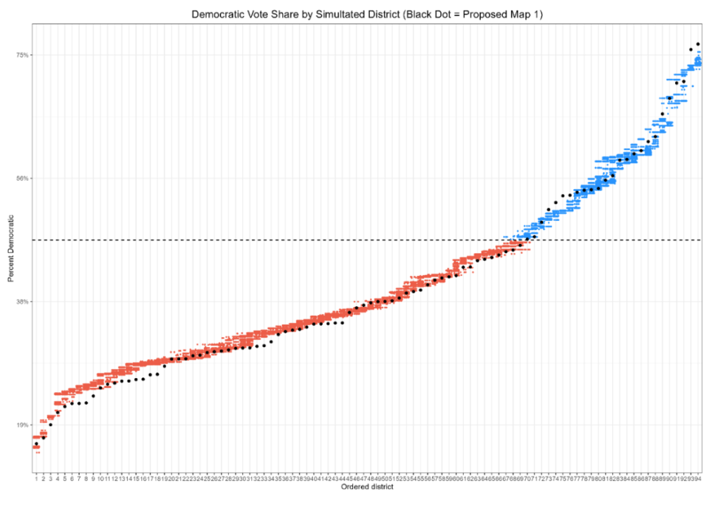
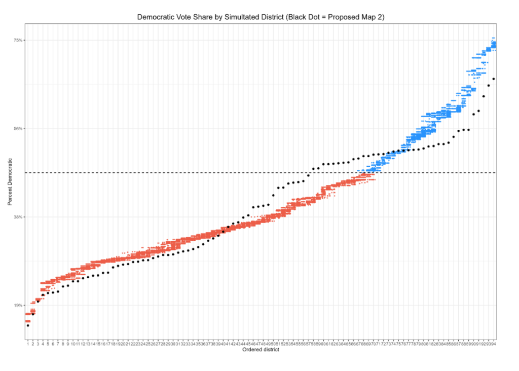
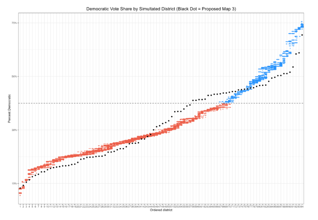
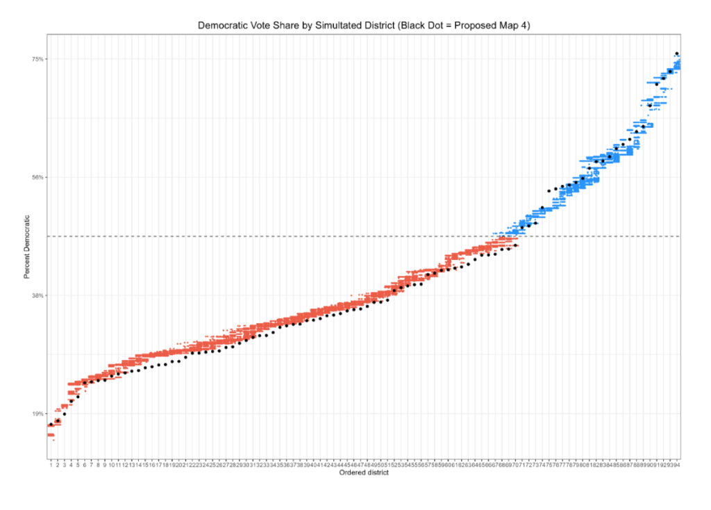
As we can see, maps 1 and 4 reasonably follow the distribution of districts produced by the politics-free maps. Two and three do not. Moreover, the latter two maps deviate in a very particular fashion. The maps roughly follow the distribution that we would expect in the reddest districts. Once we begin to approach more competitive ranges, however, a particular pattern emerges. Districts that we would expect to be strongly Republican are pushed more heavily toward equality, or even into the Democratic-leaning range, while naturally occurring Democratic districts are made much more Republican.
This pattern is the “DNA of a gerrymander.” Heavily Democratic areas are cracked – but not too much – so that Democratic partisans can be spread into otherwise-Republican areas of the state, creating more districts with a Democratic lean than we would expect from a neutrally drawn map with no intention to benefit a party. It is a small wonder, then, that these districts produce strong pro-Democratic efficiency gaps.
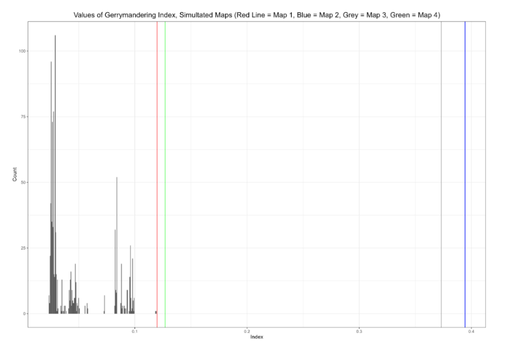
We can consolidate these into a single view by employing the “gerrymandering index,” proposed by Bangia et al (2017) and endorsed by McCartan & Imai in their paper setting forth the algorithm used to generate the districts in this report. To calculate the gerrymandering index, we take the ranked partisanship data from above for the maps, then create an average partisanship score for each one of the ranks. In other words, we look to see what, on average, the most heavily Republican district looks like in a map drawn without respect to politics, what the second-most heavily Republican district looks like, and so forth. We then see, for each proposed map, how far its ranks deviate from the respective averages. So, for example, if the 3rd most Republican district in the map ensemble is, on average, 25% Republican, and a proposed map has a 3rd most Republican district that is 26% Republican, the deviation is one percent. On the other hand if the 50th most Republican district in the random ensemble has a partisanship of 48% Republican, and it is drawn to have a partisanship of 60% Democratic, the deviation is 12%. To emphasize large deviations (and to make them all positively signed) these values are squared and added together to give us a sense of how far maps drawn without respect to political data will tend to vary naturally from expectations. The square root is then taken, which puts us back on the percentage scale.
Overall, this gives us a sense of how far the maps, taken as a whole, deviate from what we would expect a map drawn without respect to politics would be. The larger a plan’s gerrymandering index is compared to the gerrymandering indices produced by the politics-free ensembles, the less credible the argument is that the map was not drawn to bolster one party’s prospects.
The results here are striking. Maps 1 and 4 are on the fringes of the distribution of the neutrally-drawn maps. It is notable, however, from the plots above that the deviations produced by those maps occur in safely Republican territory; Map 1 in particular shows almost the exact same distribution in competitive districts as does the neutral ensemble. This may be an outgrowth of Maps 1 and 4 using slightly different configurations of minority-majority districts.
Maps 2 and 3, however, are extreme outliers. Their gerrymandering indices look nothing like those produced by politics-neutral maps. The inference drawn here is that they are not politics-neutral maps; they are drawn to help Democrats.
Putting It All Together
Finally, we can remedy at least one of the drawbacks of the partisan fairness metrics by looking at the efficiency gaps and mean-median scores produced by the neutral ensemble, and comparing it to those produced by the proposed maps; this allows us to view the range of efficiency gaps against the backdrop of the state’s political geography:
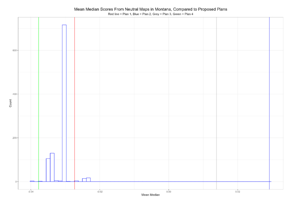
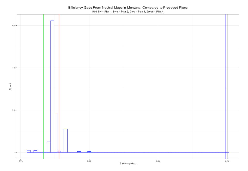
As you can see, the slight Republican bias from the mean-median scores and efficiency gap scores is replicated in the ensemble maps, which tend to produce slight Republican advantages. This is because Democratic partisans in Montana are increasingly concentrated in a handful of counties. As an example: half of Joe Biden’s vote total from 2020 was cast in just 9 counties; those same counties accounted for less than a third of Donald Trump’s vote totals. In a system of elections based on single member districts, this will inevitably work against Democrats, particularly as the state becomes more Republican overall.
In other words, the proposed maps may have similar mean-median scores in absolute terms, but the scores in maps 2 and 3 are not reflective of the underlying partisanship of the state. The scores for maps 1 and 4 are not.
Conclusion
No matter how one looks at it, the same conclusion flows from the data. Maps 1 and 4 produce small efficiency gaps, resemble the partisanship of maps drawn without heavy reliance on partisan data, and produce efficiency gaps similar to those produced by maps drawn without heavy reliance on partisan data. The same cannot be said about maps 2 and 3, which consistently present as outliers. It appears, based upon the data, that they were drawn primarily to benefit the Democratic Party. Depending on which proposed legislative redistricting map is eventually adopted by the commission, Montanans might expect significant differences in the partisan makeup of future legislatures.
About The Author
Sean Trende is a visiting fellow for Frontier Institute. He is also the senior elections analyst for RealClearPolitics and a non-resident fellow for the American Enterprise Institute. He is the author of “The Lost Majority: Why the Future of Government Is Up for Grabs and Who Will Take It,” and co-authored the Almanac of American Politics 2014. Before becoming a full-time political analyst, Sean practiced law for eight years at Kirkland & Ellis LLP, and Hunton & Williams LLP, where he represented clients in a variety of contexts, from state trial courts to the Supreme Court of the United States. Sean earned a juris doctorate from Duke University, a master’s degree in political science from Duke University and bachelor’s degree from Yale University.